
Structure of a custom section project
To create a custom section, you need to develop two main features:
- Actual section code displayed on the storefront (uses Vue).
- User settings UI that allows store owners to configure layouts, texts, colors, and other things for their needs.
- Section showcases that will work as previews in the Instant Site Editor.
The project structure for every section follows the same pattern and covers all features listed above. We can use the custom-section folder you got following the previous article as an example.
All project files listed below are mandatory:
- settings/content.ts - Declares UI elements available to users in the Instant Site Editor. Element examples: input field, image uploader, button, drop-down list, etc.
- settings/design.ts - Adds design settings for elements declared in the 'content.ts' file. Such settings include colors, font size, description, options, etc.
- settings/translations.ts - Any texts declared in the 'content.ts' and 'design.ts' files use labels. This file defines translations for these labels in one or several languages.
All files from the settings folder define the UI users will see when opening section settings in the Editor.
- showcases/{id}.ts - Each showcase file describes one section preview visible to users in the Instant Site Editor. You can add several such files to display different uses of your section, for example:
1.ts,2.ts, etc. - showcases/translations.ts - Any texts declared in showcase files use labels. This file defines translations for these labels in one or several languages.
Files in the showcases folder define previews for the section. We recommend adding several showcases for different product categories or design layouts supported in your section.
- assets/{file} - Folder for images (showcase images, default content images) and other files used in the section.
- ExampleSection.vue - Main section file with the actual code. This code loads on the storefront and in the Editor preview. Tools from the
@lightspeeed/cranewill help you with importing user settings described in files from thesettingsfolder.
These files define the actual section that will work on the storefront. You can split the Vue file into several files and declare additional variables in separate TypeScript files to make the development process cleaner.
'content.ts'
Declare UI elements for collecting user content settings in this file. After installing the section, users will see all UI elements defined in the 'content.ts' file in the Editor.
You can add multiple elements of the same to the file. Each elements is defined as the element_id object with its properties inside. The most important properties are:
| Field | Type | Description |
|---|---|---|
| type | string | Defines the UI element functionality. Available values: - INPUTBOX - Single-line input field.- TEXTAREA - Multi-line input field.- BUTTON - Configurable button with several available actions: Scroll to the section, Go to the link, Compose an email, Call phone, Go to the store, Go to the site page.- IMAGE - Image uploader.- TOGGLE - On/Off toggle.- SELECTBOX - Drop-down list where users choose one of the available options.- INFO - Unmodifiable text with an optional button. Use it to add some information to the Editor, for example: "Visit developer's website: [Go to site]" |
| label | string | Name of the element displayed in the Ecwid admin. Add a $label.label_name reference here and describe its translation in the 'translations.ts' file. |
| placeholder | string | Placeholder text displayed inside the input field in the Editor. Add a $label.label_name reference here and describe its translation in the 'translations.ts' file. Available for INPUTBOX and TEXTARES types. |
How it looks in the code:
export default {
	element_id: {
		type: 'INPUTBOX',
		label: '$label.section_description.label',
		placeholder: '$label.section_description.placeholder',
	},
} as const;
How it looks in the Editor:
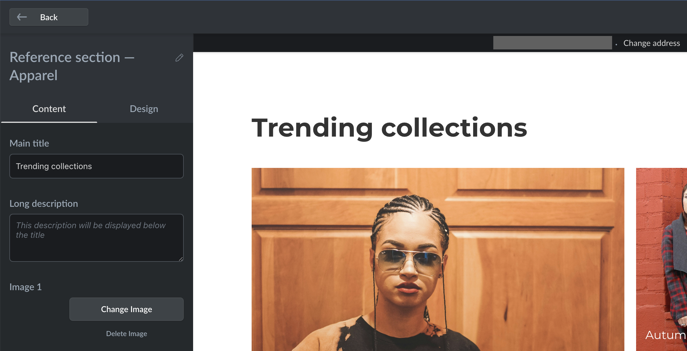
For example, if you want users to specify the header text, define an input field (INPUTBOX type) in this file. You'll also need to define labels in the /settings/translations.ts file and import element values to the Vue file. Check out the example section code you get from crane tool to see how it works.
'design.ts'
Once you declare user settings to the 'content.ts' file, define design settings for these elements. Design settings are also based on different types pre-defined by Ecwid. Each design type has its unique configuration. For example, when you add an INPUTBOX input text field that can be interacted with through the Editor, you can also give users the ability to change text color and size.
Configuration defined in the 'design.ts' file will appear in the IS Editor when users install the section. Find the full list of design types and their configs below.
How it looks in the Editor:
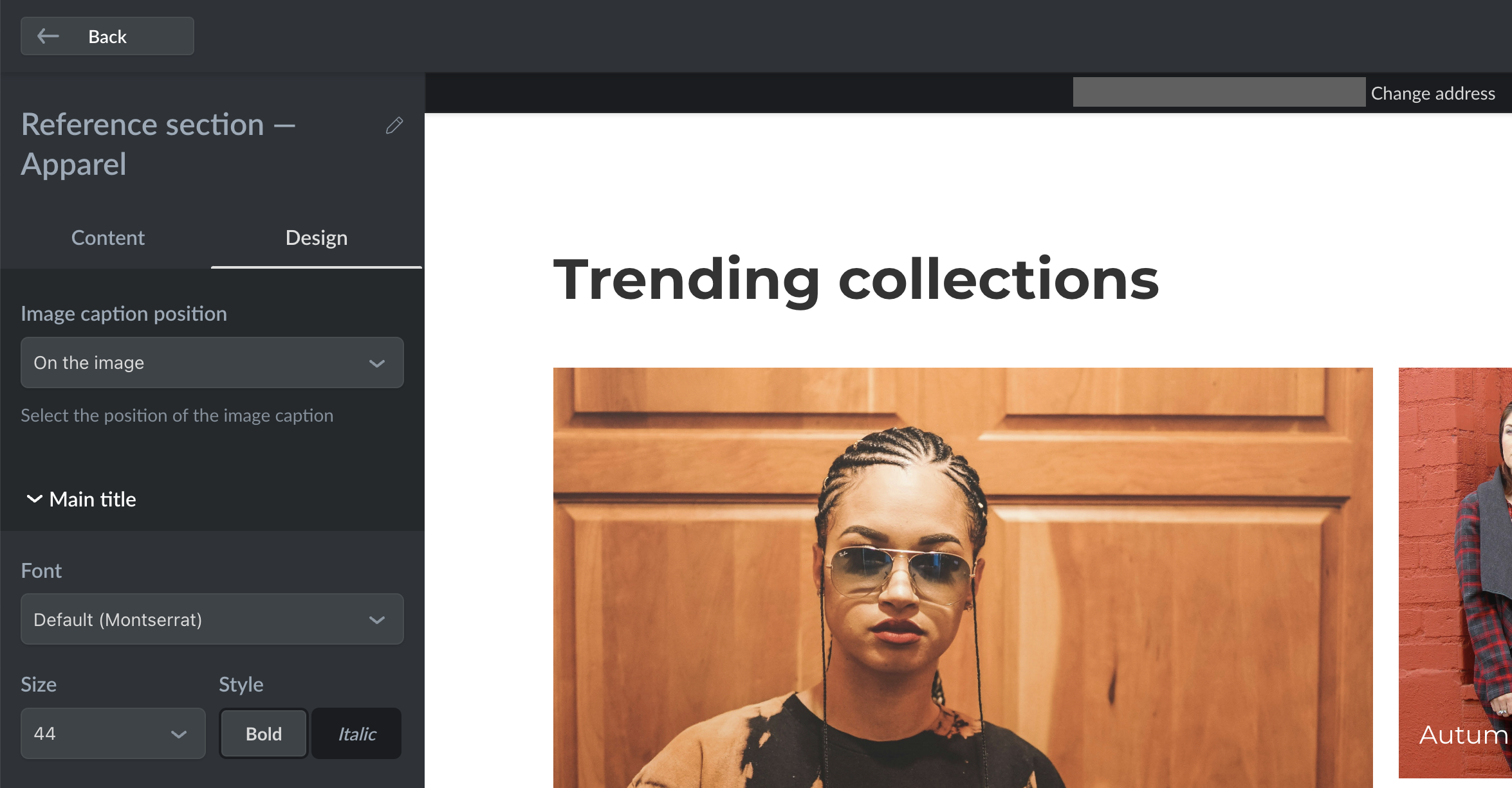
TEXT
TEXTConfiguration for text elements.
| Setting | Type | Description |
|---|---|---|
| type | string | Always TEXT. Works only with INPUTBOX and TEXTAREA element types. |
| label | string | Element name. Use $label to add translations. |
| colors | array{string} | An array of colors in the HEX code to choose from. Maximum: 7 colors. |
| sizes | array{number} | An array of text sizes to choose from. Maximum: 7 sizes. |
| defaults:font | string | Default text font. We recommend leaving global.fontFamily.body here to match the current store font. |
| defaults:size | number | Default text size. |
| defaults:bold | boolean | Defines if the text is bold by default. |
| defaults:italic | boolean | Defines if the text is italicized by default. |
| defaults:color | string | Default text color in HEX code. |
Code example for 'design.ts':
element_id: {
	type: 'TEXT',
	label: '$label.element_id.label',
	colors: ['#FFFFFF66', '#0000004D', '#00000099', '#64C7FF66', '#F9947266', '#C794CD66', '#FFD17466'],
	sizes: [12, 13, 14, 15, 16, 17, 18, 20],
	defaults: {
		font: 'global.fontFamily.body',
		size: 16,
		bold: false,
		italic: true,
		color: '#333',
}
BUTTON
BUTTONConfiguration for button element.
| Setting | Type | Description |
|---|---|---|
| type | string | Always BUTTON. Works only with the BUTTON element type. |
| label | string | Element name. Use $label to add translations. |
| colors | array{string} | An array of colors in the HEX code for the button background to choose from. Maximum: 7 colors. |
| sizes | array{number} | An array of button text sizes to choose from. Maximum: 7 sizes. |
| defaults:font | string | Default text font. We recommend leaving global.fontFamily.body here to match the current store font. |
| defaults:size | string | Default button size. Available values: DEFAULT, SMALL, MEDIUM, LARGE. |
| defaults:appearance | string | Default button appearance. Available values: SOLID_BUTTON, OUTLINE, TEXT_LINK. |
| defaults:shape | string | Default button shape. Available values: PILL, RECTANGLE, ROUND_CORNERS. |
| defaults:color | string | Default text color in HEX code. |
Code example for 'design.ts':
element_id: {
	type: 'BUTTON',
	label: '$label.element_id.label',
	colors: ['#FFFFFF66', '#0000004D', '#00000099', '#64C7FF66', '#F9947266', '#C794CD66', '#FFD17466'],
	defaults: {
		font: 'global.fontFamily.body',
		size: 'MEDIUM',
		appearance: 'OUTLINE',
		shape: 'PILL',
		color: '#333',
	},
}
IMAGE
IMAGEConfiguration for image uploader element.
| Setting | Type | Description |
|---|---|---|
| type | string | Always IMAGE. Works only with the IMAGE element type. |
| label | string | Element name. Use $label to add translations. |
| colors | array{string} | An array of colors in the HEX code for the image background to choose from. Maximum: 7 colors. |
| defaults:overlay | string | Default image overlay. Available values: DEFAULT, COLOR, GRADIENT, NONE. |
| defaults:color | string | Default text color in HEX code. |
Code example for 'design.ts':
element_id: {
	type: 'IMAGE',
	label: '$label.element_id.label',
	colors: ['#FFFFFF66', '#0000004D', '#00000099', '#64C7FF66', '#F9947266', '#C794CD66', '#FFD17466'],
	defaults: {
		overlay: 'COLOR',
		color: '#333',
	},
}
TOGGLE
TOGGLEConfiguration for toggle element.
| Setting | Type | Description |
|---|---|---|
| type | string | Always TOGGLE. Works only with the TOGGLE element type. |
| label | string | Element name. Use $label to add translations. |
| description | string | Element description displayed in the Instant Site Editor under the element. |
| defaults:enabled | boolean | Defines the state of the toggle when users install the section. Set true to automatically enable the toggle when the section is installed. |
Code example for 'design.ts':
element_id: {
	type: 'TOGGLE',
	label: '$label.element_id.label',
	description: '$label.toggle.description',
	defaults: {
		enabled: true,
	},
}
SELECTBOX
SELECTBOXConfiguration for the "selectbox" element that creates a drop-down list in the Editor.
| Setting | Type | Description |
|---|---|---|
| type | string | Always SELECTBOX. Works only with the SELECTBOX element type. |
| label | string | Element name. Use $label to add translations. |
| placeholder | string | Placeholder text when no option is chosen. The defaults:value overrides placeholder text. |
| description | string | Description under the drop-down. |
| options:value | string in array{obj} | Value for one of the available options in the drop-down list. |
| options:label | string in array{obj} | Text label for one of the available options in the drop-down list. |
| defaults:value | string | Defines the default value when a user installs the section. If not specified, users see placeholder text instead. |
Code example for 'design.ts':
element_id: {
	type: 'SELECTBOX',
	label: '$label.element_id.label',
	placeholder: '$label.element_id.placeholder',
	description: '$label.element_id.description',
	options: [
		{
			value: 'one',
			label: '$label.element_id.one.label',
		},
		{
			value: 'two',
			label: '$label.element_id.two.label',
		},
	],
	defaults: {
		value: 'two',
	},
}
BACKGROUND
BACKGROUNDConfiguration for the section background which is not an element type defined in the 'content.ts' file.
| Setting | Type | Description |
|---|---|---|
| type | string | Always BACKGROUND. |
| label | string | Element name. Use $label to add translations. |
| colors | array{string} | An array of colors in the HEX code for the background to choose from. Maximum: 7 colors. |
| defaults:style | string | Default background style. Available values: COLOR (solid color), GRADIENT (gradient between two colors). We recommend using a solid color as a default background (COLOR). |
| defaults:color | string | Default background color. We recommend leaving 'global.color.background' here. |
Code example for 'design.ts':
element_id: {
	type: 'BACKGROUND',
	label: '$label.element_id.label',
	colors: ['#FFFFFF66', '#0000004D', '#00000099', '#64C7FF66', '#F9947266', '#C794CD66', '#FFD17466'],
	defaults: {
		style: 'COLOR',
		color: 'global.color.background',
	},
}
COLOR_PICKER
COLOR_PICKERConfiguration for a color picker which is not an element type defined in the 'content.ts' file.
| Setting | Type | Description |
|---|---|---|
| type | string | Always COLOR_PICKER. |
| label | string | Element name. Use $label to add translations. |
| description | string | Description under the color picker. |
| colors | array{string} | An array of colors in the HEX code to choose from. Maximum: 7 colors. |
| defaults:color | string | Defines the default color when a user installs the section. |
Code example for 'design.ts':
element_id: {
	type: 'COLOR_PICKER',
	label: '$label.element_id.label',
	description: '$label.element_id.description',
	colors: ['#FFFFFF66', '#0000004D', '#00000099', '#64C7FF66', '#F9947266', '#C794CD66', '#FFD17466'],
	defaults: {
		color: 'global.color.background',
	},
}
'translations.ts'
Once your section has text labels for elements inside the 'content.ts' and 'design.ts' files, you can add one or several translations for them in the 'translations.ts' file. The 'translations.ts' file in the "showcases" folder does the same, but only for text labels used in showcase files.
The 'translations.ts' file has a simple structure: declare an object named with a language code, for example, en: {} and put '$label': 'text' pairs inside. Labels in this file are referred to the same way as in other files. For example, if you added $label.inputbox_1_name in the 'content.ts' file, call it the same in 'translations.ts'.
Code example:
en: {
	'$label.inputbox_1_name': 'Title',
	'$label.inputbox_1_desc': 'Description',
	'$label.color_picker_name': 'Select color for the navigation arrows',
},
es: {
	...
},
nl: {
	...
}
If you add several translations, make sure that every language has the same set of text labels. Otherwise, you may face errors when deploying the section to Ecwid.
Check out the example section from the crane tool. It has working 'translations.ts' files for both "settings" and "showcases" folders.
'showcases/{id}.ts'
Showcase files allow you to set up a preview for the section browser and default settings for that preview. For example, an image gallery block can have two showcases, showing the "summer collection" in the first showcase and the "winter collection" in another.
Showcase configuration includes:
| Setting | Type | Description |
|---|---|---|
| showcaseId | string | Numeric showcase ID converted to string type. Defines the order in which showcases are displayed in the Editor. Starts with '1'. |
| previewImage | obj | Showcase preview image for section browser in the Editor. |
| blockName | string | Text label for the section name displayed in the left menu. |
| content | obj | Default settings for the section elements declared in the 'content.ts' file. |
| design | obj | Default settings for types declared in the 'design.ts' file. |
Showcase files don't have to cover all declared content and design settings. Additionally, you can add several images for one IMAGE element type depending on the user's device and screen size.
Code example for 'showcase/1.ts' file:
showcaseId: '1',
previewImage: {
	set: {
		ORIGINAL: {
			url: 'preview_image.jpg',
		},
	},
},
blockName: '$label.showcase_1_name',
content: {
	text_input_1: {
		type: 'INPUTBOX',
		text: '$label.showcase_1_input_1',
	},
	text_input_2: {
		type: 'TEXTAREA',
		text: '$label.showcase_1_input_2',
  },
  image_content_1: {
		type: 'IMAGE',
		imageData: {
			set: {
				ORIGINAL: {
					url: 'new_arrivals_pc_high.jpeg',
				},
				MOBILE_WEBP_LOW_RES: {
					url: 'new_arrivals_mobile_low.jpeg',
				},
				MOBILE_WEBP_HI_RES: {
					url: 'new_arrivals_mobile_high.jpeg',
				},
				WEBP_LOW_RES: {
					url: 'new_arrivals_pc_low.jpeg',
				},
				WEBP_HI_2X_RES: {
					url: 'new_arrivals_pc_high.jpeg',
				},
			},
			borderInfo: {},
		},
	},
design: {
	text_input_1: {
		type: 'TEXT',
		font: 'global.fontFamily.body',
		size: 44,
		bold: true,
		italic: false,
		color: '#333',
	},
	background: {
		type: 'BACKGROUND',
		style: 'COLOR',
		color: 'global.color.background',
	}
}
'server.ts', 'client.ts', 'type.ts'
These are internal files, but there is one thing you need to keep in mind. If you change the name of the main .vue file, update it in the 'server.ts' and 'client.ts' files.
Code example:
import ExampleSection from './ExampleSection.vue'; // default
import MySection from './MySection.vue'; // updated
The 'type.ts' should remain unchanged.
'section.vue'
This is the main building file for the section code, where you import settings added in the 'content.ts' and 'design.ts' files. Our crane tool provides you with an easy way of importing content to .vue files.
Code example:
import { useImageElementDesign, useSelectboxElementDesign, useTextElementDesign } from '@lightspeed/crane';
import { useImageElementContent, useInputboxElementContent, useTextareaElementContent } from '@lightspeed/crane';

const imageText1 = useTextareaElementContent<Content>('image_text_1');
const imageContent4 = useImageElementContent<Content>('image_content_4');
const imageLink1 = useInputboxElementContent<Content>('image_link_1');

const textDesign = useTextElementDesign<Design>('image_text');
const imageDesign = useImageElementDesign<Design>('image_content');
const positionDesign = useSelectboxElementDesign<Design>('image_text_position');
Your IDE should also highlight syntax and show fields available inside constants declared this way.
Summary
Let's combine what we've learned. With the crane tool you can start building custom sections for Instant Site with ease. The tool allows you to get an example section code to learn its structure and see how it works, to deploy built sections to Ecwid, and to effortlessly create a set of settings for the Instant Site editor, so users could tune the section to their own preferences and needs.
To create a fully working setting, first declare it in the 'content.ts' file:
export default {
  user_input_1: {
    type: 'INPUTBOX',
    label: '$label.user_input_1.label',
    placeholder: '$label.user_input_1.placeholder',
  },
} as const;
Then define what design settings should be available for it in the 'design.ts' file:
export default {
  user_input_1: {
    type: 'TEXT',
    label: '$label.user_input_1.label',
    colors: ['#FFF', '#000', '#333'],
    sizes: [18, 20, 22, 24, 26],
    defaults: {
      font: 'global.fontFamily.body',
      size: 20,
      bold: true,
      italic: false,
      color: '#333',
      visible: true,
    },
  } as const;
Then import the created setting into the .vue file:
import { useInputboxElementContent, useTextElementDesign } from '@lightspeed/crane';

const userInput1 = useInputboxElementContent<Content>('user_input_1');
const userInput1Design = useTextElementDesign<Design>('user_input_1');
Now you can add a set of user settings for your section and use these settings in the code. We are excited to see what you'll be able to build!
Updated 5 months ago